Introducing Google’s New Mobile Guidelines & Tools
It’s no longer a surprise, we all know that online mobile usage is growing at the speed of light and quickly taking over desktop usage across industries. As a result, mobile search and mobile applications are the first touchpoints between users and brands. 2014 was already announced as the year for mobile and 2015 will be the year when not being on mobile will start hurting businesses.
Here are a few statistics that reveal the importance of mobile usage in online behaviors:
- In 2014, mobile traffic (search and apps combined) exceeded desktop traffic
- There are approximately 2 billion desktop computers in the world and more than 5 billion mobile devices
- Mobile searches are expected to surpass desktop searches in 2014
- In the USA, 94% of people with smartphones search for local information on their phones.
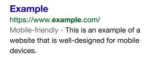
Search engines are putting emphasis on cross-device strategies and especially mobile-friendly experiences. Most recently, this has come with the official launch on November 18th of “mobile-friendly” labels in search results.
This new search development means that websites which are not displayed in a user-friendly way on mobile devices will not receive the label and may see a drop in their traffic as users will most likely choose to click on mobile-friendly advertised results.
So how can you make sure that your website or application is fully optimized for mobile and tablet devices, providing seamless experiences across channels?
Google recently launched their Mobile Guide which provides webmasters and marketers with step by step guidelines to design optimized mobile websites.
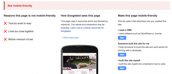
The first step is to determine if your website is adapted for mobile usage. You can use Google’s new Mobile-Friendly Testing Tool to understand how your website performs on mobile devices. The tool lets you know how “Googlebot” (Google’s main web crawler) sees your page and reasons why it may not be optimized for mobile. It will also refer you to resources to learn how to fix these issues and create a mobile-optimized website.
Depending on your results, you may need to optimize your website’s technical set up for mobile devices. There are several options available such as developing a responsive web design which adapts to the size of a user’s screen or creating a separate mobile site.
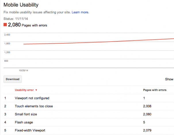
Both the Mobile-Friendly Testing Tool and the new Mobile Usability Report tool in Google Webmaster Tools can give you more details about how to optimize your website for mobile. The Mobile Usability Report tells you exactly what are problematic elements and on which pages such as viewport configuration, elements that are too close together, fonts that are too small or issues with flash usage. You can find it in Google Webmaster Tools under the “Search Traffic” tab.
Once you’ve taken care of developing a mobile-friendly website, you will want to make sure that search engines can find, crawl and index your website correctly which means they need to be able to understand what your mobile setup is.
Check your robots.txt file to make sure that search engines bots can crawl your pages, add specific HTML markup to reference your mobile website, create a mobile sitemap, and optimize your page loading speed so you can facilitate their task and improve your chances of receiving Google’s coveted “mobile-friendly” label.