To put it simply, we’re living in the age of screens. Screens of all sizes, of different operating systems, and all have their own set of rules for mobile content. According to a study done by Business Insider, the global smart phone penetration exploded from 5% in 2009 to 22% by the end of 2013. That being said, tablets are showing faster adoption rates than smartphones; it took four years for smartphones to penetrate 6% of the market, while tablets took only two.
So what does this mean for email marketing? In 2013, 51% of emails were opened via a mobile device, a significant leap from 33% in 2012 and 10% in 2011. With increased mobile usage, audiences are less tolerable to bad e-mail marketing. Encountering users with short attention spans and providing mobile content that is less than user-friendly, your emails will more than likely get deleted, or worse, unsubscribed.
Here’s what you can do right now to optimize your email campaigns for mobile, and make sure you don’t get lost in the mix.
1. “Twitterfy” Your Subject Line
If you’re on Twitter, you know that a lot of time and energy is spent to compose the perfect tweet. You have to manipulate wording, make sure that whatever you share is insightful, all in the confines of 140 characters or less. Determining the subject line of your e-mail campaign is no different. The subject line is your email campaign’s first point of contact with your target audience. For most mobile email applications, the subject line is cut off at approximately 30 to 35 characters, which means you have a very small opportunity to prove your e-mail is worth reading. And guess what? Your audience spends less than 3-4 seconds to make that decision. So like Twitter, spend some time determining how the subject line will showcase your e-mail best. Remember, people open promotional e-mails if they feel that they can gain something, so speak to your audience and provide value without coming off as spammy. A|B test different subject lines, determine which works for your audience, and test again.
2. Don’t Forget About the PreHeader
The preheader is the quick snapshot of your email, which is usually pulled from the first few lines of content in the e-mail itself. Don’t make the mistake of letting the “If you’re having trouble viewing this email” line overtake this prime real estate! Do something useful with it — tie it in with the subject line, tease the content, give an incentive, SOMETHING. Just don’t let it go to waste, and of course, test, test, test.
3. Make Sure Content is Consumable
Reading an exorbitant amount of copy on a mobile device is daunting, so don’t make your subscribers do it. Be clear, concise, and make sure your email uses a readable font size. Generally, body copy font size should be at least 14 pixels and headlines should be 22 pixels.
Chunking is a method that will separate content in a way that can be easily consumed by your readers. Get rid of any excess baggage in your email that may impede on user experience, like unnecessary navigation bars.
4. Be “Finger Friendly”
The term “click” does not apply in the mobile realm. Smart phones and tablets both share the “touch” feature, and users use a finger rather than a mouse to navigate. Instead of using the word “click”, consider other call-to-action terms that will motivate users to go to your website.
Also, if your links are too small to accurately touch, you’ve lost your audience. Emphasize your call-to-actions by utilizing a large and “finger friendly” button that won’t get lost in your copy or is too close to other buttons.
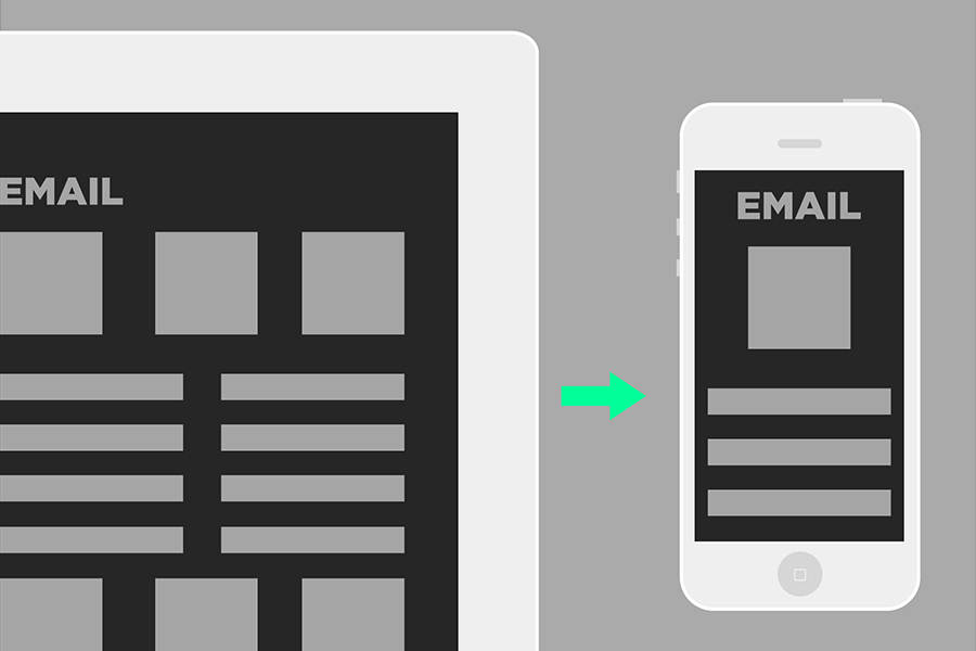
5. Implement a Responsive Design
To avoid having to design a new e-mail for every possible combination of platforms and screen sizes, create a design template that is responsive. A responsive e-mail design will resize content and images based on rules that you have preemptively determined when a customer has reached a screen size threshold. Users are comfortable with vertical scrolling, but if they are forced to do any horizontal scrolling for content, consider it game over. You’ve been deleted.
6. Make Sure Your Mobile Experience Transfers to Your Website.
If you’re planning on executing a gorgeous e-mail campaign that is optimized for mobile, please make sure that your landing page is mobile-ready too! Even if your website is not fully optimized, develop landing pages that are mobile friendly.
Remember, interstitials on a desktop landing page does not do well in mobile. They’re an annoyance and nearly impossible to close out of. Your visitor will instantly leave if they can’t get where they want. This applies to long and horrible forms as well. Make it easy, and just capture their email.
Basically, create the path of least resistance for mobile users to convert once they have entered the funnel.
Now that you’re an expert in mobile email marketing, go send your campaign!