With 2012 fast approaching, it’s time we took a look at where web design is headed for the coming year. In 2010, web design started to move towards minimalism and it’s being fully embraced in 2011. Minimalism is nothing new in graphic design, but when applied to websites, there’s more breathing room, a distinguished hierarchy and straightforward information. More importantly, the focus is on the content.
Minimalism shows no signs of stopping in 2012 as technology gets more immersive and users continue to demand instant gratification. The average attention span of web visitors is 8 to 10 seconds. In that short amount of time, we have to tell them they’re at the right place, then organically lure them in. While part of that is having a “cool” website, the minimalist concept of “less is more” needs to be applied where aesthetics marries function.
Based on popularity, visual appeal, effectiveness and awesomeness, we believe the following web design trends are here to stay.
HTML5 and CSS3
It’s no question that HTML5, CSS3, Javascript and jQuery are already becoming web design standards that can do pretty much everything Flash does, but better. HTML5 creates more readable code and builds layouts that help the structure mark-up. It features smarter forms, typography, social tools, drag and drop functionality and new APIs. CSS3 functions include rounded corners, drop down menus, animated buttons, multiple backgrounds, web applications and @font-face technology.
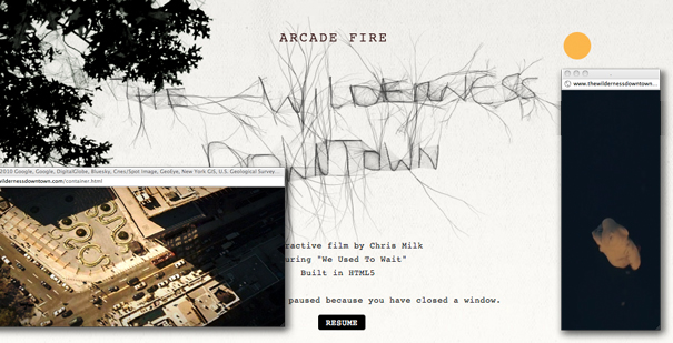
EXAMPLE: The Wilderness Downtown
An interactive film experience that turns your whole browser into a movie screen. PS. Hover your mouse over the birds.
Mobile Ready
With the number of mobile users increasing every year, having a website that is both mouse-friendly and touch-friendly is more of a necessity than a trend. But have no fear, CSS3 can accommodate mobile technology in web design. In fact, mobile sites play a major influence in the minimal web since it calls for simpler pages, faster loading times, interactivity and quicker messages. Omniture found that mobile-optimized experiences produced an average 75% higher rate of engagements per mobile visitor.
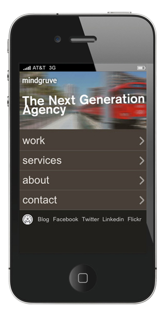
EXAMPLE: Mindgruve Mobile Site
When you type “mindgruve.com” on your mobile browser, you get directed to our mobile site where our portfolio is available at your fingertips. Also note how it’s consistent with our website.
Sliders
A large, interactive header with a slider makes a great first impression and inserting them has never been easier with jQuery plugins. Sliders reduce the need to go through the navbar by visually summarizing the entire site into a smaller space. Their interactivity and easy navigation also translates well onto the mobile web.
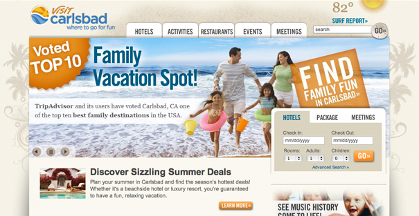
EXAMPLE: Visit Carlsbad
For one of our loyal clients, Visit Carlsbad, we used a slider at the top of their website to showcase all this city has to offer.
3D Effects
The web is also delving into the illusion of depth, sometimes to the point where websites are like a movie or game. We’re all for using layers, shadows, gradients, transparencies and textures to create dimension. Just make sure they don’t distract the reader. Subtlety can go a long way.
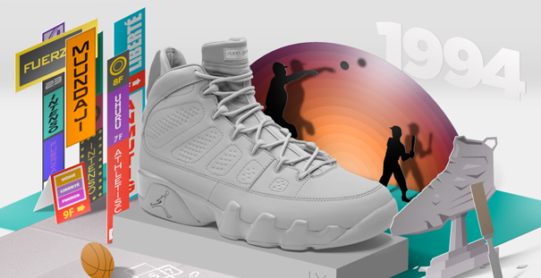
EXAMPLE: Nike History of Flight
Nike takes you on an interactive timeline of their relationship with Michael Jordan in the style of a pop-up book.
One-Page Websites
Since 80% of website visitors don’t navigate away from the homepage, fitting all the content onto one webpage can be efficient. To spice it up, HTML5, CSS3 and Javascript can make the page multi-faceted with tabs, animations and pop-ups. On the other hand, it isn’t suitable for all websites. For instance, e-commerce sites wouldn’t do so well if they were one page. This trend is better for sites with less content such as events, personal sites, products and micro sites.
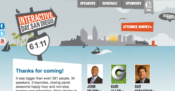
EXAMPLE: Interactive Day San Diego
We had a lot of fun creating this one-page site for San Diego’s most interactive conference event. The best part: No Flash!
Parallax Scrolling
Parallax scrolling is a technique that has been used in video games for years and web design is making brilliant use of it. It’s when the background and foreground images move or change at different speeds to create a sense of depth. All you need is jQuery, CSS3 and good imagery. To take it even further, elements can pop out or move as the user scrolls or moves the mouse around. The possibilities can make one-page websites creative and interesting.
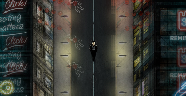
EXAMPLE: Ben the Bodyguard
This one-page website for an iPhone app blurs the line between a game and a website.
Grid-Driven Layouts
Inspired by print, editorial web layouts are perfect for constantly updated content and SEO. They add structure and organize information so it’s easier to scan and comprehend. Big, link-filled headers and footers also make finding information a cinch. The 960 grid system is the most popular to use since it’s adaptable to all screens. It simply uses CSS to help streamline web development workflow based on a width of 960 pixels.
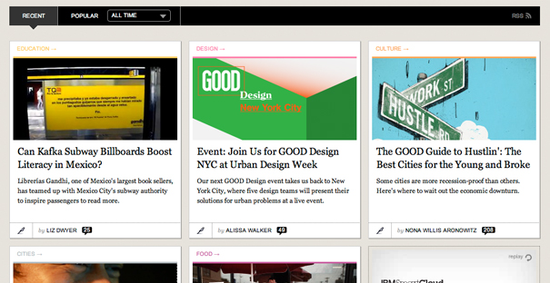
EXAMPLE: Good
This multimedia news source treats its website as an interactive print publication.
Typography
As more browsers support font-replacement methods, web designers can integrate custom fonts without having to make them image-based. That means we don’t have to stick to the overused Arial, Times and Century Gothic fonts all the time. We can use bolder, bigger and funner typography that’ll be crisp and indexed to grab the user’s attention. Typography has the power to make or break a design. So we advise to use 1 or 2 fonts that are legible on all devices, and to save the big typography for headers, sub-headers and the like.
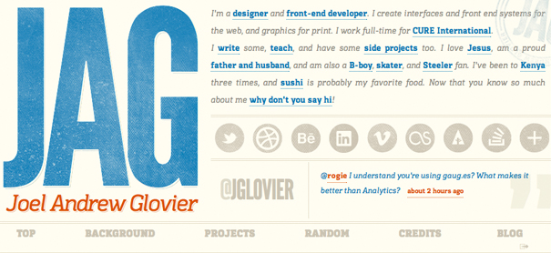
EXAMPLE: Joel Andrew Glovier
This developer’s portfolio stands out with colorful and impactful typography that isn’t overbearing.
Large Backgrounds
With high definition cameras, better image optimization, smarter loading methods and faster internet connections, large photos and intricate illustrations are no longer taboo on the web. Having them as a background can draw in the user, set the mood and have a lasting impression. As long as it’s relevant and doesn’t compete with the content, the imagery can tell a story faster than a paragraph of content.
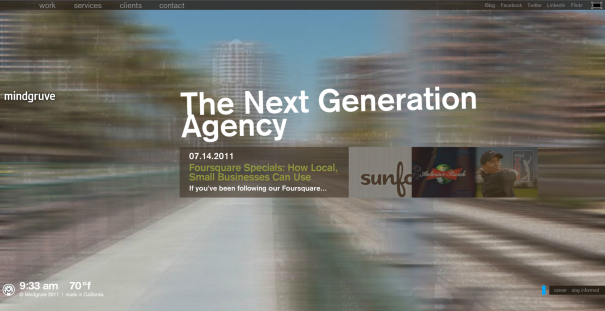
EXAMPLE: Mindgruve
Our website incorporates large photo backgrounds that reflect our content and company. PS. Watch for the trolley on the home page.
So there you have it, our top picks for web design trends. With the user in mind, they practice simple, intuitive and clever design with emphasis on content. However, everything needs a purpose for the message to be properly conveyed. Being too minimal and holding back information is just as bad as being cluttered. More importantly, if the technique doesn’t help your business goals, then there’s no point in using them either. With that said, as web design continues to explore new possibilities and break barriers (and us right there with it), we don’t see these design trends going anywhere for a while.