It’s that time again — the ADDYs are upon us! 2012 was full of groundbreaking projects for us and accordingly, we went big and entered twelve of our finest into ten categories. Although we know for sure we won at least something (thanks for the heads up, Ad Club!), your guess is as good as ours when it comes to what won the judges over. Take a sneak peek at our entries and let us know what projects you think deserve the illustrious Golden ADDY.
- Advertising Self-Promotion, Print: Mindgruve Employee Handbook
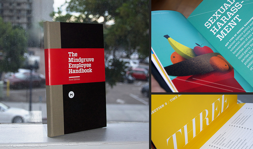
The Mindgruve Employee Handbook isn’t your typical boring as sin PDF booklet. It’s a fully bound book with entertainment on every page. Talented team members partnered up to make the content fun and fresh and the graphics unique and quirky — kinda like us. Seriously, this is one handbook you want to read.
- Advertising Self-Promotion, Digital Advertising: Mindgruve Website
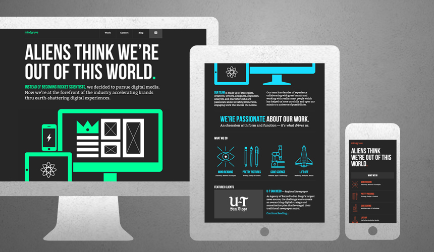
In 2012, we decided it was time to do for ourselves what we do for our clients— create a website that represents our updated and unique brand identity. Using an “RGB” concept, we simplified our content, streamlined and innovated our nav, and bulked up our company blog to put an even better foot forward on the web. Check out our new look at Mindgruve.com!
- Apps, Tablet: U-T San Diego iPad News App
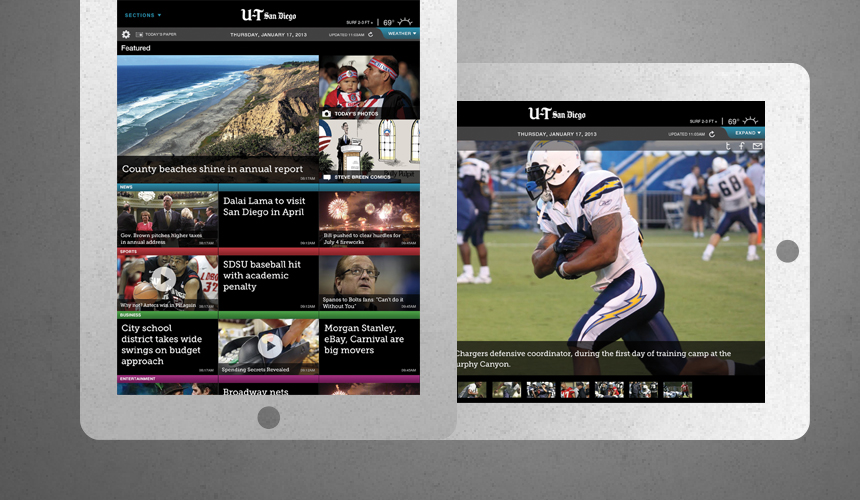
We took the U-T San Diego newspaper from black-and-white to digital in a multimedia first for the news organization: an iPad app. Combining intuitive design and functionality, our final product turned out to be a news junkie’s dream and snagged a number-one spot in the iTunes Store, pulling in over 32,000 downloads in its first five months. Watch a demo to see it in action!
- Apps, Web-based: MDVIP Connect
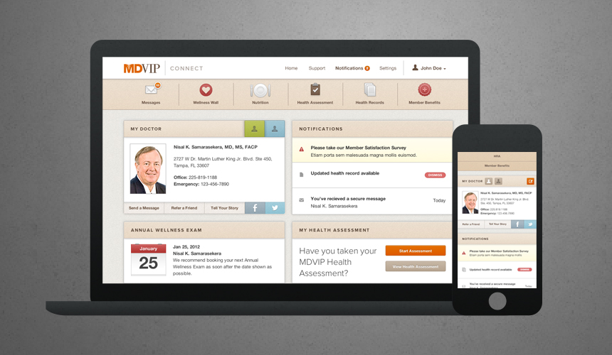
Soon after launching MDVIP.com, we rolled out MDVIP Connect, an innovative dashboard that brings anything MDVIP members need to manage their health and communicate with their doctor into one ultra-convenient online platform. With health assessments, instant updates on health records, personalized nutrition and exercise plans, secure messaging with their doctor, and more available on desktop and mobile, members can use the responsive site just about anywhere life takes them.
- Campaign Entries: “Carlsbad is Where” Digital Campaign
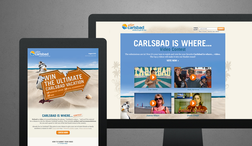
To amplify the city of Carlsbad’s unique, community-focused image, we partnered up with Visit Carlsbad to create a multichannel digital campaign centered on the idea that Carlsbad is where great stories are made. Featuring creative video content, a comprehensive social strategy, and a wildly successful interactive contest, the “Carlsbad is Where…” campaign created major buzz and drew sweet, funny, and wild stories from Carlsbad fans of all ages. Check out the contest winners and fan favorite submissions!
- Elements of Advertising, Logo: Premium Rewards
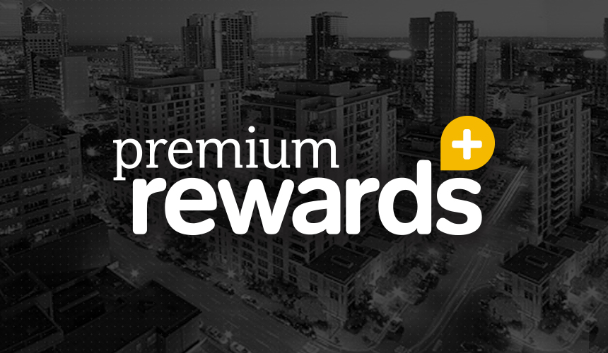
Premium Rewards is an upcoming extension of the U-T San Diego, designed to give members instant rewards at the places they shop and dine the most. Playing on the ubiquitous geolocator pin, our designers created a sleek, eye-popping logo that speaks to locals and builds curiosity well before launch.
- Micro Sites, Services: Visit Carlsbad Testimonials
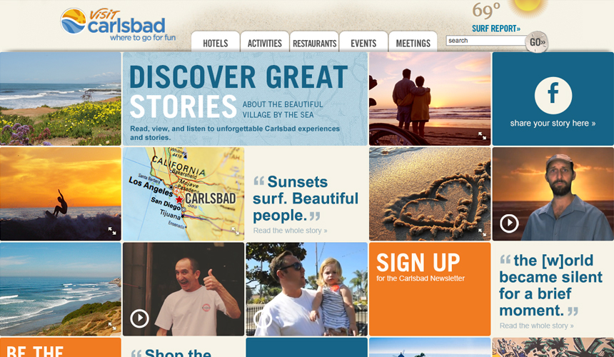
When Visit Carlsbad needed a new way to share fan stories and testimonials, we thought outside the box to create a colorful, interactive page for VisitCarlsbad.com. Brightly hued tiles feature stories, video content, and CTAs to encourage visitors to get involved with the brand through email or social channels.
- Sales Promotion, Trade Show Exhibit: Mindgruve Cookie Booth
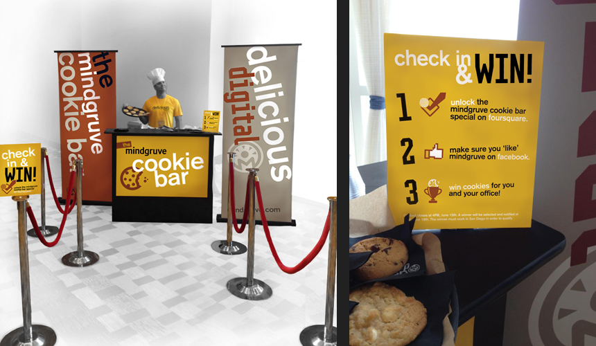
At Interactive Day San Diego 2012, Mindgruve served up some delicious digital (and baked) goods to hungry conference goers at our company cookie bar. With tasty flavors and “shots” of milk, the booth was a huge success and resulted in tons of email and social buzz. Get excited for its big comeback at IDSD 2013!
- Websites, Consumer— Services
Chickasaw Country Website/Chickasaw Country Mobile Website
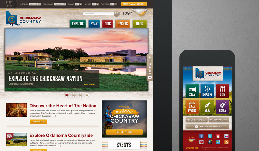
ChickasawCountry.com and its mobile counterpart draw visitors to Chickasaw Country, Oklahoma with intuitive navigation and unique tools that make exploring and booking a breeze. With multimedia galleries, dropdown menus, and explore-by-city functionalities, the site is accessible to anyone in Chickasaw Country’s audience, while a bold color scheme represents the region’s rich cultural history. To bring the best of Chickasaw Country’s events, hotels, restaurants, and attractions into one convenient place, ChickasawCountry.com boasts an interactive trip planner and hotel search booking bot. Since launch, the site has seen a 142% jump in traffic.
MDVIP Website
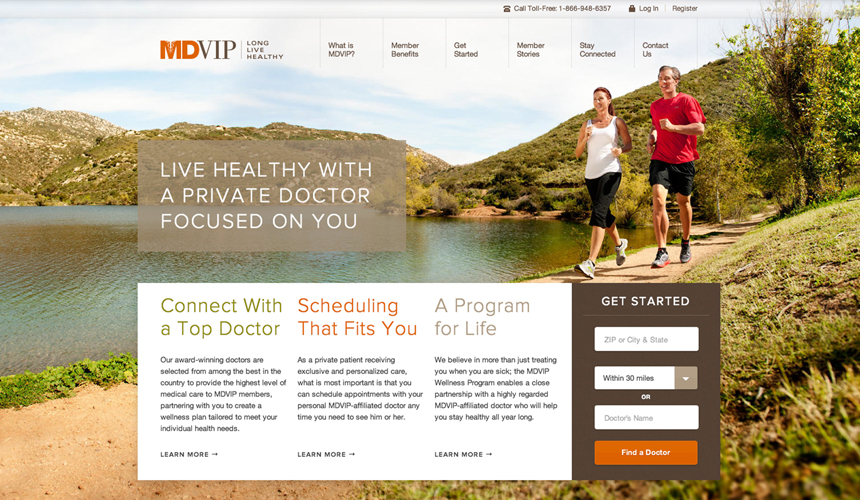
To increase membership and reposition branding for MDVIP, we did a complete website overhaul and redesign to launch the new MDVIP.com. After conducting a full site content and SEO audit and a competitor analysis, we worked on tone development, content creation, and development featuring parallax design and a custom-built CMS. The new site conserves expenses; improves efficiency; and increases value to members with 24/7 doctor communication, community support, and innovative tools in a user-friendly, eye-catching environment. We created a suite of assets including informational landing pages, MDVIP Connect, and features like interactive health assessments, personalized online nutrition counseling, and round-the-clock secure messaging to align with the site’s target user — upwardly mobile, health-conscious baby boomers. With responsive design, members can enjoy an integrated health experience at their doctor’s office, at home, or on the go on their favorite mobile devices.
- Publication Design, Book: MDVIP Style Guide
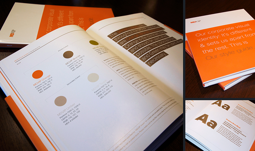
Our MDVIP revamp didn’t stop at MDVIP.com and MDVIP Connect. To outline rules and preferences for all print and digital content moving forward, we developed a fully bound style guide. Branded and emblazoned in MDVIP orange, the guide contributed to creating and establishing a recognizable brand identity and voice.