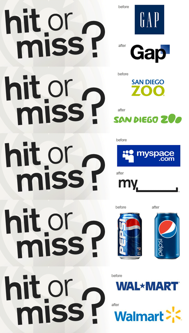
In recent months, we’ve seen rebranding hits and misses by several well-known companies that have either left consumers embracing their new image or alienated them with uninformed changes. Understanding how a brand sets the stage for meaningful interaction and advocacy within your audience, we studied these recent efforts to get to the heart of what makes a successful rebranding: balance. Company goals, messaging, culture and strengths must balance with audience expectations and a digital strategy to effectively introduce your new brand identity.
But, before undergoing a rebrand of any sort, it’s important to consider the reasons for doing so:
- First, sympathizing with Business Insider, a “successful rebranding involves overhauling a company’s goals, message, and culture.” Simply changing a logo isn’t enough to change the bond you have (or hope to create) with your audience.
- Second, knowing your strengths can help develop a new brand that caters to you and drive future success with brand advocates.
- Third, rolling out a new brand through a well-defined digital strategy that includes online and mobile channels is imperative in engaging your target at the spaces where they spend a majority of their time.
- Finally, as Myspace discovered in their recent brand refresh, awareness of your audience and their expectations of you is just as important as how you view yourself.
An intricate strategy in place to balance these areas can mean saving time and work wasted on an unappealing brand that lacks direction and impact. With this in mind, we took a closer look at two brands that have made strides and setbacks in their brand.
The Hit: San Diego Zoo
- Company Goals, Message and Culture: Job well done. Before rolling out a new, cohesive brand for all three San Diego Zoo entities, the goal was to ensure they appear unified and highlight the San Diego Zoo’s efforts in conservation.
- Core Strengths: The San Diego Zoo’s strengths lie in the culture that it has developed since 1916. Conservation and education are important elements of who they are and we believe the new brand reflects this well through the identity system and communication of zoo programs and initiatives.
- Digital Rollout: Before the new brand was introduced, San Diego Zoo did a wonderful job of engaging the community. After the rebrand, their Facebook page, Twitter page and website continue to create an educational experience that allow the community to help in conservation efforts, play educational games and adopt animals.
- Audience Expectations: San Diego Zoo did their research. They knew the name “Safari Park” better represents the experience people have at San Diego Zoo Safari Park. They also understand the fun, family-oriented experience of both parks and the educational experience of the institute needed to be captured in the new identity system when compared to the old, corporate-looking logo.
The Miss: Gap
- Company Goals, Message and Culture: Unfortunately, Gap fired a complete dud. Rolling out a new (less than liked) logo in early-October, the public was quick to call them out with “Crap Logo Yourself.” Gap did little to connect their new visual representation with what a Gap spokesperson later told us was meant to “signify Gap’s transition from classic America design to modern, sexy, cool.”
- Core Strengths: Gap’s strength as a clothing brand is that they are considered iconic by many, creating what Brand New calls “a cool, breezy, and sophisticated brand visual language.” The hasty switch to the new logo did little to enhance the appeal they had or highlight their shift to “modern, sexy, cool.”
- Digital Rollout: Overall, Gap is doing what they can to create a large digital presence (recent Groupon deals and Facebook check-ins come to mind), but have yet to embrace it in a branded way to engage with their customers beyond “big savings.” Prior to the new logo, Gap did a good job at engaging the community with store news, giveaways and styling tips. After the new logo, all hope for a revised digital strategy was lost when Gap failed to properly introduce the online community to it.
- Audience Expectations: Gap found out a little too late what their audience wanted. After introducing the new logo and receiving a flood of negative feedback, Gap attempted to quell the mob’s anger by calling it a “crowd sourcing project,” which did little to smooth things over. In the end, Gap ditched the new logo and crowd sourcing plans, illustrating why proactively discovering a target audience is much better than reacting to their negativity.
As you can see, a rebranding must be balanced through all four areas we looked at. What recent rebrands do you think are hits or misses?